Latido Natural
Brand identity and design for a boutique hotel and restaurant in Nosara, Costa Rica, created as a sanctuary for modern seekers and rooted in nature, renewal, and community.
About the Business
Latido Natural is a boutique hotel in Nosara, Costa Rica, a sanctuary created for modern seekers looking for rest, connection, and growth. Just steps from Playa Pelada and away from the busier town of Guiones, the hotel offers a slower rhythm and a grounded atmosphere where guests can find renewal.
At the heart of the experience are the spa, yoga shala, and the Chirrido restaurant, each designed to blend nature, comfort, and community. While Latido Natural embodies quiet, reflection, and well-being, Chirrido translates this ethos into cuisine rooted in Nicoyan tradition and local ingredients.
Project Goal
The goal was to create a cohesive brand identity that connects the hotel and the restaurant under one vision, while allowing each to have its own personality. Latido Natural needed an identity that embodied renewal and mindfulness, while Chirrido required a brand voice tied to local culinary heritage, yet still visually aligned with the hotel’s core identity.
Deliverables Included
Brand Strategy
3 Logo systems
Visual Identity
Illustration toolkit
Brand patterns
Art Direccion
How the Design Supports the Brand Vision
Brand Identity & Logo Design
-
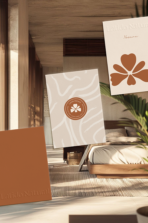
Latido Natural: The logo combines a hand-drawn orchid (a flower native to Nosara) with a refined and customized serif typeface. The orchid’s abstract form also resembles a person in yoga or meditation. The serif’s subtle movements suggest water and flow, tying back to nature and the ocean. The tagline appears in a sans serif with soft, flowing lines, adding rhythm and cohesion.
-
Chirrido: Its icon merges a corn cob and an abstract sun ,symbols of nourishment, vitality, and the Nicoyan landscape. The design also plays on the name “Chirrido,” referencing the crackling sound of corn as it roasts or crunches, instead of the chirp of a bird, which would have been a more literal approach. The typography reinforces the connection with Latido Natural: the accent script typeface from the main brand was chosen for the name, while the subtitle typeface was used for the tagline. These choices ensure cohesion across both identities while giving Chirrido its own voice within the brand family.
Color Palette
The color palette was designed to capture the essence of Nosara and the Blue Zone lifestyle. For Latido Natural, deep ocean blues, terracotta, cream, and soft neutrals evoke balance, renewal, and connection to the natural rhythm of the sea and land. For Chirrido, olive green and soft sand serve as grounding primaries, complemented by terracotta and beige to reflect nourishment, tradition, and warmth.
Visual Elements & Patterns
-
A set of hand-drawn illustrations adds warmth and personality across digital and print applications, from menus and brochures to signage and stationery.
-
Organic patterns derived from these drawings provide texture and continuity across touchpoints without overpowering the design.
Messaging & Tone
-
Guided by the positioning “A sanctuary for modern seekers,” the tone balances stillness, connection, and growth.
-
Marketing phrases such as “Rest. Reflect. Reconnect.” or “Step away from the rush, step into Latido Natural” were crafted for use in social media, signage, and promotional materials.


Final Result
This project brought together the essence of Latido Natural as a sanctuary for modern seekers and the vibrant spirit of Chirrido as its culinary heart. Through hand-drawn icons, cohesive typography, and palettes rooted in the land, the identity reflects authenticity, harmony, and renewal. From the spa’s calming atmosphere to the restaurant’s nourishing flavors and the hotel’s serene spaces, every element was designed with coherence in mind, creating a seamless brand experience where guests can rest, connect, and align with the rhythm of Nosara.


"Laura’s intake process showed her deep knowledge of branding and ensured she was fully connected to my vision. She went above and beyond by researching the customs and cultural context of my retreat’s location in Costa Rica, which gave her concepts a unique authenticity. Throughout the process, she presented thoughtful and creative ideas, including hand-drawn brand elements versatile enough to be used across marketing collateral and even interior design. Communication was seamless: Laura stayed responsive and available, and our two calls (kickoff and feedback) were efficient and productive. The final brand identity she delivered is not only beautiful but also incredibly thorough and adaptable. I highly recommend working with Laura for any brand identity project , she’s creative, professional, and a joy to collaborate with."
AMANDA RIVERA